
Why mobile-first design wins more customers.
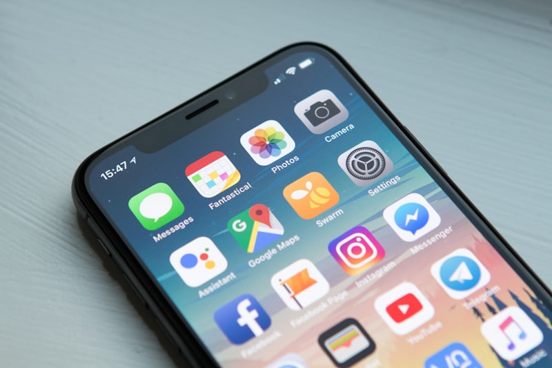
Most visitors to a business website are on a phone. That is not a prediction, it is the current reality, and it changes what a website needs to be. Mobile-first design is not about making a desktop site shrink. It is about building the mobile experience first and treating it as the version that has to work.
Why mobile is where decisions happen
People research on the sofa, on the train, between meetings. They compare options on a phone and expect the site to load fast, answer a question and feel natural to use with a thumb. If the experience is cramped, slow or confusing, they leave and try the next result. The site that feels effortless on a phone wins the visit — and the visit is where enquiries and orders begin.
What mobile-first actually means
Mobile-first is an approach, not a toggle. You design for the small screen first: single-column layouts, generous tap targets, readable type without zooming, and a navigation that fits a thumb. Then you scale up. The desktop version inherits a layout that was designed with constraints in mind, which is why mobile-first sites usually look more considered on every screen.
This is different from responsive-after-the-fact, where a desktop layout is squeezed into a phone and the result is small text, side-scrolling and fiddly menus. Our responsive and mobile-friendly builds start from the phone and work outward, so the small-screen experience is deliberate rather than accidental.
What it changes for conversion
Navigation
On a phone there is no hovering. Menus, filters and links all need to be obvious and tappable. If a visitor cannot find the call to action in a few seconds, the page has already lost them.
Forms
Long forms on a phone are brutal. Short fields, sensible defaults and letting the phone’s own keyboard handle the right input type all reduce friction. Every field you can remove is a field that increases the chance of completion.
Checkout
Most abandoned checkouts happen on mobile. Fast-loading product pages, a clear checkout flow and payment options that fit a phone all matter. If you run a store, this is where mobile-first thinking directly affects revenue.
The mobile usability checklist
- Tap targets big enough to hit without zooming or precision.
- Text readable without pinching — no minimum font sizes below about 16px.
- No horizontal scrolling on any page width.
- Forms use the correct input types so the right keyboard appears.
- Menus work with a thumb, not a cursor.
- Images scale down cleanly without breaking layout.
Where it hurts if you ignore it
Ignoring mobile does not just lose a few visitors. Google evaluates pages against mobile usability as a baseline, so a poor phone experience can hold back rankings on a desktop-first site too. And competitors with a clean mobile experience take the visitors you lose. The cost of ignoring it is quiet and compounding.
How we approach it
For new builds we design mobile-first from the start, from wireframes through to handover. That includes testing on real devices, not just resized browser windows. If you are redesigning, the same principle applies: audit how the site currently behaves on a phone, fix the mobile experience first, then let the desktop follow. Our custom website development and UX/UI design work both start with how people actually use the site, and mobile is where most of that usage happens. If you are building a mobile app rather than a website, the same thinking applies — mobile app development is mobile-first by definition.
A website that works brilliantly on a phone is not a nice-to-have. It is the baseline for competing in 2026.
